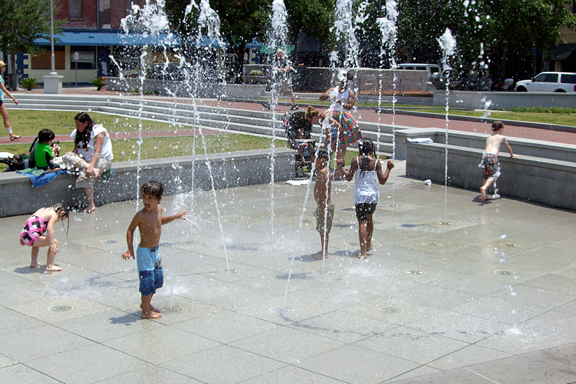
We had a conversation in Power Boothe‘s theory class about whether or not art has value. Someone asked, does a blank canvas have value? The art students though that it did not. It’s just wood, they said, scraps of cloth. Everyone agreed that there was work put in to cut the wood and weave the cloth and construct the canvas—it costs money to buy a prepared canvas—but it had no functional value, no use value, and so was worthless. (Walter Benjamin’s famous essay, The Work of Art in the Age of Mechanical Reproduction defines use value versus cult value in passing, as does Adolph Loos’s tyrannical essay, Ornament and Crime.) I disagreed. The blank canvas has incredible value in its potential—to be art. What’s more, the blank canvas is the hope of art, a gesture towards the power and transcendence of human creativity. It’s the emotional bell weather of our society. Here is the potential for beauty, for greatness, it says, for novelty, for personal expression—despite all odds. Despite the crushing weight of the world and our own doubts, here is the chance to escape, into art. What could be more valuable?

Color lovers
There’s a website called “colourlovers.com” that’s a bit disappointing; just a bunch of palettes. Of course, palettes can be very useful. Color is a big part of my awareness—the color of things around me, of the sky, of people’s clothes—it’s part of how I see and organize the world.
At my mother’s house in New York I was struck by the quality of light one morning. I took some photos of a pair of pink leather slippers my cousin brought back from Morocco, contrasted against my red nail polish and a purple skirt. The watercolor on the left approximates that arranged palette.

Other palettes compose themselves. I snuck the photo below on the subway: navy + yellow book + red nails + canvas, and painted the swatches above. The palette above is a version of this color set.

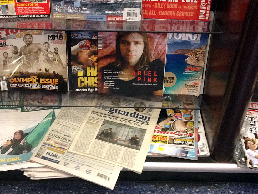
A newsstand caught my eye because of an article called “Ariel Pink” featured on one cover—almost my name—and I liked the mix of pink and peach and brown in the photo of a guy in a black dress. That’s the palette above on the right.
I’m not sure what I’ll do with these palettes… for now they’re just reminders of pretty things.

Zuhandenheit
Martin Heidegger, in Being and Time, describes the property of zuhandenheit, or being ready-to-hand. It’s a concept central to his worldview a concept I believe to be his most important contribution to Western philosophy. Heidegger uses the term zuhandenheit to describe a useful, working tool, one that is plainly ready-to-hand and can be used without having to consciously consider its presence. Consider, for instance, that you can walk without thinking about your feet. Now the foot is not a “tool” per se, but it is something utilized without thinking about it consciously. The foot only becomes present when it does not function, when it is broken or injured in some way.
Heidegger’s examples of tools that are ready-to-hand include “the hammer, the plane, and the needle.” Now it’s true there’s a learning curve associated with any particular tool; a needle can prick you, a plane can slice you, a hammer can damage your thumb if you are unfamiliar with its proper use. However, once the tool is mastered, it is readily and repeatedly available as a medium for accomplishing tasks. It and you function perfectly together such that you can focus solely on the task and ignore the tool. The tool becomes an extension of your body.
The notion of zuhandenheit is important because it had not yet been considered in philosophy before Heidegger. Up to then, philosophy described the world as filled with people and things. People have senses through which they perceived things and their properties. A hammer, in this configuration, is a hunk of shaped metal at the end of a wooden handle. Clearly, this ignores the hammer’s status as a tool—its function, its utility, its reason for being; everything that makes a hammer a hammer. Heidegger’s phenomenology contrasts the tool’s being ready-to-hand, zuhandenheit, with vorhandenheit, being present-at-hand, or just there. A leaf is just there, a rock is just there, a broken hammer is just there until you fix it. (If you pick up the rock and use it to pound corn into flour, then of course it becomes a tool.)
These distinctions came to mind recently during an oil painting class I’m enrolled in at the Hartford Art School taught by the former dean of the school, Power Boothe. Professor Boothe is a well regarded artist and it’s probably better that I don’t closely follow the art world because I might be too star-struck to be in his class. He’s a set designer as well, which is very exciting, theatrical design being the charismatic cousin to architecture’s austere façade of controlled composition. As a teacher, Power is very approachable and remains engaged with each student in the class, often exclaiming that someone’s work reminds him of such-and-such master painter from the 19th or 20th century. On these occasions he repairs to his office and returns with the appropriate monograph, handing it to the oil-paint-and-linseed-spattered student, her brush in hand.
With my “brush in hand” I’ve experienced a painful lesson in zuhandenheit. Oils are difficult to assimilate. I painted quite frequently as a child, but always with acrylics. They’re cheap and water soluble, so I’m sure their particular procurement was a conscious choice on my parents’ part. “Real painting,” to me, was always achieved with oils; that’s how all the paintings in the museums were made. (I recall fixating on a Bonnard at the Met but the memory might be fabricated.) I attempted an oil painting on glass when I was a senior in high school; it was awful. I managed to mix the paint, but I had no idea that I should use linseed oil and turpentine as thinner. I was so used to the nature of acrylics—how they dried, how they mixed—that I just couldn’t get a feel for this thick, pasty medium. I was too impatient or too inexperienced to wait for the paint to dry, and I didn’t know about the technique of glazing, using oils like watercolors, all water and very little tint. I kept lathering the paint on like plaster, eventually giving up… the final work looked like melted wax. It was a portrait of a boy I’d met. I’m glad he never saw it.
The first two painting assignments Power gave the class were apples, one black-and-white and one color. The black-and-white one went along pretty well. I didn’t have to worry about mixing because the whole composition was shades of grey. The color painting, however, was a disaster. I couldn’t mix the tones I wanted; everything kept blending together into a mushy brown; and the white/yellow underlay I foolishly added was far too overpowering. (The white in oil paint is nuclear strength.) I ended up slapping on paint with a palette knife to cover my mistakes… it was pretty terrible. I bought another canvas and tried again, this time with the glazing technique my husband recommended and was much happier with the results. I’ve since attempted to paint the stairwell in Louis I. Kahn’s British Art Center, (hard; I can’t let go of the notion that straight, almost axonometric lines should look a certain way,) and a self-portrait (easier; probably because the softer shapes still convince when only approximated).
Is the paint brush a tool, ready-at-hand? For me, not yet. But soon.
Yohann Gène: Pioneer
I‘ve been watching the Tour de France this summer, awed by the physical prowess of the 190+ cyclists who brave the equivalent (it is said) of marathon after marathon, for three weeks straight. The American commentary is on Versus, an NBC satellite, with two seasoned Brits at the call and a former American competitor offering color commentary. There are not too many Americans in the Tour, and only one in the running for an overall victory, so most time is spent analyzing team tactics and supposed individual rivalries (the channel, after all, is called “versus.”)
The other day I noticed a man with dark skin among the sea of white riders. Quite a tan, I thought foolishly, and then I realized he must be African or part African. I was shocked to realize that he is, in fact, the only man of African descent in the entire Tour. His name is Yohann Gène, a Frenchman whose family is from Guadaloupe (a French territory), riding for Team Europcar. Most Tour cycling teams are based in one European nation or another, but all have international rosters. Despite this, and despite Europe’s rising racial diversity, most riders represent a single ethnic group from a wholly European source. That is, the Tour is not diverse; it is neither representative of the world at large nor even of the modern population of Europe.
I can’t imagine that cycling is such a narrow sport that more Asian or African or South American riders would not be qualified to ride in the Tour, as prestigious as it is. This is a sorry statement for modern Europe to make, given the recent tides of racial unrest in countries like France and Denmark, and the rise of nationalist, anti-immigration parties across the continent.
One might think that, given the complete lack of reporting about Gène on Versus or anywhere else, that having a rider of African descent on one’s team is not such a big deal. Wrong. Team Europcar’s manager says, “We have been subject to racism. I had to deal with a few problems and contact sponsors of two foreign teams about it. After the doping incidents, I couldn’t let racism be part of cycling.” Are you serious? This is happening? What decade is this?
This is, clearly, not a post about architecture, but I’m so incensed that I thought I’d vent a little rage here in this blog. To clarify, I’m angry that no major news outlet is reporting on this major breakthrough, and I’m angry that elite athletes and their managers would turn out to be racist. I am not a jingoistic sort, but as an American I feel the least I can do is champion the principles of civil rights that have allowed our culture to thrive. Maybe we can get Versus to cover Gène’s story. Put a comment on the Versus Facebook cycling page, or tweet @bobkeroll (the Versus American commentator) and let them know that breaking ancient racial barriers is important to you. Thanks!
The vamp of Savannah


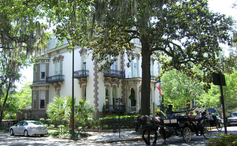
I was in Savannah recently for a wedding and took lots of pictures. Savannah, Georgia is a picture-perfect southern town (if you stay in the historic area) preserved through a combination of General Sherman’s mercy and Savannah College of Art and Design’s diligence. Half of downtown seems to be owned by SCAD, with each department occupying its own architecturally rich structure. One of my fellow travelers was determined to take only “coffee table book” pictures, and did so with great success. This is a place filled with lavishly wrought iron balconies, blossoming dogwood and magnolia trees, spanish moss, and pretty fountains. Couples from across the country come here to be married and have their pictures taken among the city’s 22 garden squares. I decided to concentrate instead on the overlooked modern parts of town. Above (from top to bottom) you see a school or a convent located across the street from the Cathedral of St. John the Baptist, the Savannah Theater (it looks like a movie theater but it’s a stage), and an office building—perhaps a bank or government building—on the corner of East Broughton and Abercorn.


Above are some photos of quirky Savannah, including a parking garage with graffito, a DIYer’s home, and the SCAD art house movie theater.
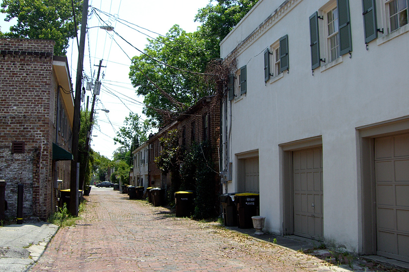
The town’s urban plan is of great interest. It was drawn up by English General James Oglethorpe for the purpose of military defense against the Spanish and the indigenous nations to the south and west, and for the prevention of disease. The plan’s beauty seems to be of only secondary interest to its creator. The core idea is the creation of very small neighborhoods, or wards, each anchored by a square that includes both tything lots and trust lots, the later of which were small blocks along the shorter sides of the square intended to house only civic buildings. It’s alleyways are a New Urbanist’s dream, and I took photos of those as well for my colleague Robert Orr (though he probably has his own stock already).
Savannah is a place with a lot of folk lore and a lot of interesting people (especially because of the presence of its art school—I saw Manolo Blahnik on the street going to a private showing of an exhibition about his shoes). The film Midnight in the Garden of Good and Evil was shot here, which I re-watched immediately upon my return. They also serve rose petal ice cream at the local homemade ice cream shop.
Finally, I’ll leave you with a song, Hard Hearted Hannah. My mother sang it to me when I told her about my trip. It’s a tin pan alley song from 1924. You can hear Belle Baker sing it, or Ella Fitzgerald. Here’s another fantastic, melancholy version from Ray Charles.
In old Savannah, I said Savannah,
the weather there is nice and warm!
the climate’s of the Southern brand,
but here’s what I don’t understand:They got a gal there, a pretty gal there,
who’s colder than an arctic storm,
got a heart just like a stone,
even ice men* leave her alone!They call her “Hard Hearted Hannah,”
the vamp† of Savannah,
the meanest gal in town.
Leather is tough, but Hannah’s heart is tougher,
she’s a gal who loves to see men suffer!To tease ’em, to thrill ’em,
to torture and then kill ’em,
is her delight, they say.
I saw her at the seashore with a great big pan,
there was Hannah pouring water on a drowning man!
Hard Hearted Hannah, the vamp of Savannah, GA!musical interlude
verse added laterTalk of your cold, refrigeratin’ mamas,
brother, she’s a polar bear’s pajamas!
To tease ’em, and thrill ’em,
to torture and kill ’em,
is her delight, they say.
An evening spent with Hannah sittin’ on your knees,
is like travelin’ through Alaska in your BVDs!
She’s Hard Hearted Hannah, the vamp of Savannah, GA!
* An ice man, by the way, is the fellow who would deliver ice to your house, not the unlucky prehistoric warrior discovered in Austria in 1991. † A “vamp” is a term used to refer to a woman who uses her sexuality to entice and somehow to harm men. It’s a shortened version of “vampire.”
Faces on buildings

There’s something special about faces on buildings. I don’t mean advertising billboards—even when painted on, billboards are too slick to have the same affect. Faces on buildings stare out at you like a totemic god, a tiny shrine writ large. I spotted this first face in the Greektown neighborhood of downtown Detroit. It’s wry and literary-looking.

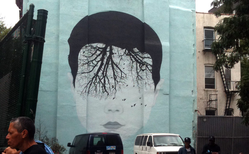
This face, a portrait of Ann Frank, is more commanding. It’s visually stark in large blocks of black and white. For me the image is a representation of the holocaust, causing no emotion that the face of a cheerful little girl would usually stir. Her name is not written there, just the words, “Believe in People” on the top right. It’s a compelling portrait, especially at this size. This is painted behind the Yale School of Art in on Crown Street. I hope it stays up for a while. Was it someone’s final project?
A block away are a series of blank buildings, large facades with no windows or doors, no human scale. Wouldn’t it be wonderful to paint faces here? The side of this Walgreens pharma-superstore dropped in a sea of parking (with a strangely short parking structure next door) would be a perfect candidate. Perhaps something similar to Jaume Plensa’s portrait fountain in Chicago’s Millenium Park, with the faces of local New Haven residents. It would be like Felice Varini’s Square with Four Circles on the garage downtown. Here’s my mock up for your review.
